Flutter TabBar: A complete tutorial with examples

To implement TabBar in your Flutter app, Follow the following steps:
In this tutorial, we’ll tell you everything you need to know about TabBar in Flutter, show you how to implement tabs in your Flutter app, and walk you through some TabBar examples.
In This Blog, we will Cover The Following Topics

  1.  Setting up Default or Simple TabBar in Flutter
  2.  How to customize or Colored the tab indicator in TabBar
  3.  Making scrollable tabs with TabBar
  4. Changing tabs programmatically
  5.  Listening for tab change event
  6.  How to implement TabBar without AppBar
  7.  Preserving the state of tabs
  •  Setting Up Default or Simple TabBar In your flutter app

To Implement a Default TabBar in your Flutter app Simply Follow the three-Step Below
Step 1: Wrap the Scaffold widget inside DefaultTabController.
Step 2: Place the TabBar widget as the bottom property of AppBar
Step 3: Provide TabBarView in the body of the AppBar. TabBarView is like PageView, which is used mostly with TabBar because it shows the widget based on the currently selected tab 


now Let's write the Code for Default or Simple TabBar In your flutter app                           

import 'package:flutter/material.dart';

void main() {
  runApp(MaterialApp(
    title: "TabBar Tutorials",
    home: TabBarPage(),
  ));
}

class TabBarPage extends StatefulWidget {
  TabBarPage({Key? key}) : super(key: key);

  @override
  State<TabBarPage> createState() => _TabBarPageState();
}

class _TabBarPageState extends State<TabBarPage> {
  @override
  Widget build(BuildContext context) {
    return DefaultTabController(
      length: 3,
      child: Scaffold(
        appBar: AppBar(
          title: const Text("TabBarPage view"),
          bottom: const TabBar(tabs: [
            Icon(Icons.home),
            Icon(Icons.account_balance),
            Icon(Icons.security_update_warning),
          ]),
        ),
        body: const TabBarView(children: [
          //YOU Can put any number of page here but the Number of
// page must much `the number of length in the
//DefaultTabController above or
          //DefaultTabController length must equl to TabBar
// and also must equl to  TabBarView

          Icon(Icons.home),
          Icon(Icons.account_balance),
          Icon(Icons.security_update_warning),
        ]),
      ),
    );
  }
}


How to customize or Colored the tab indicator in TabBar

 You Can Customize The TabIndictoer in TabBar to make it looks Good.
Below are some examples of ways you can modify the TabIndicator to improve the user experience and overall appearance of your app.

Now Let us Modify The TabIndicator In Different Ways,


Tab color

To alter the color of a tab 
indicator: Add, indicatorColor: Colors.amberaccents;  Property to TabBar

TabBar(
  indicatorColor: Colors.amberAccent,
  tabs: [],
)
Here is a full Source code with TabIndicator Color changed to amberAccent.

import 'package:flutter/material.dart';

void main() {
  runApp(MaterialApp(
    title: "TabBar Tutorials",
    home: TabBarPage(),
  ));
}

class TabBarPage extends StatefulWidget {
  TabBarPage({Key? key}) : super(key: key);

  @override
  State<TabBarPage> createState() => _TabBarPageState();
}

class _TabBarPageState extends State<TabBarPage> {
  @override
  Widget build(BuildContext context) {
    return DefaultTabController(
      length: 3,
      child: Scaffold(
        appBar: AppBar(
          title: const Text("TabBarPage view"),
          bottom: const TabBar(
            indicatorColor: Colors.amberAccent,
             tabs: [
            Icon(Icons.home),
            Icon(Icons.account_balance),
            Icon(Icons.security_update_warning),
          ]),
        ),
        body: const TabBarView(children: [
          //YOU Can put any number of page here but the Number of page must much `the number of length in the DefaultTabController above
          //DefaultTabController length must equl to TabBar and also must equl to  TabBarView

          Icon(Icons.home),
          Icon(Icons.account_balance),
          Icon(Icons.security_update_warning),
        ]),
      ),
    );
  }
}


Tab size
To alter the Size of the TabBar indicator :

 Add, indicatorSize: TabBarIndicatorSize.label, Property to TabBar This makes The indicator size equal to the width of The labels the Default value is TabBarIndicatorSize.tab.


TabBar(
  indicatorSize: TabBarIndicatorSize.label,            
  tabs: [],
)

Here you Can use a full source code with TabBar indicator size is equal to indicatorSize: TabBarIndicatorSize.label, which means the indicator size equal to the width of the label

import 'package:flutter/material.dart';

void main() {
  runApp(MaterialApp(
    title: "TabBar Tutorials",
    home: TabBarPage(),
  ));
}

class TabBarPage extends StatefulWidget {
  TabBarPage({Key? key}) : super(key: key);

  @override
  State<TabBarPage> createState() => _TabBarPageState();
}

class _TabBarPageState extends State<TabBarPage> {
  @override
  Widget build(BuildContext context) {
    return DefaultTabController(
      length: 3,
      child: Scaffold(
        appBar: AppBar(
          title: const Text("TabBarPage view"),
          bottom: const TabBar(
              indicatorColor: Colors.amberAccent,
              indicatorSize: TabBarIndicatorSize.label,
              tabs: [
                Icon(Icons.home),
                Icon(Icons.account_balance),
                Icon(Icons.security_update_warning),
              ]),
        ),
        body: const TabBarView(children: [
          //YOU Can put any number of page here but the Number of page must much `the number of length in the DefaultTabController above
          //DefaultTabController length must equl to TabBar and also must equl to  TabBarView

          Icon(Icons.home),
          Icon(Icons.account_balance),
          Icon(Icons.security_update_warning),
        ]),
      ),
    );
  }
}


Tab height
To alter the Size of TabBar indicator 
Weight: Add,
indicatorWeight: 10, Property to TabBar This makes The indicatorWeight equal to 10. you can set your own indicatorWeight like this.

TabBar(
  indicatorWeight: 10,      
  tabs: [],
)

Change the indicator

You can change the indicator itself, and Add your own Custom Indicator

TabBar(
  indicator: BoxDecoration(
    borderRadius: BorderRadius.circular(50), // Creates border
    color: Colors.greenAccent), //Change background color from here
  tabs: [],
)

Background image

To set a background image with TabBarIndicator:

indicator: BoxDecoration(
    color: Colors.greenAccent,
    image: DecorationImage(
        image: AssetImage('assets/images/placeholder.png'),
        fit: BoxFit.fitWidth)), Making scrollable tabs with TabBar

Making scrollable tabs with TabBar

Horizontally scrollable tabs
The TabBar widget has a property dedicated to make horizontally scrollable tabs. Set the isscrollable to True, and the job is done. You’ll have to set it explicitly because it defaults to False


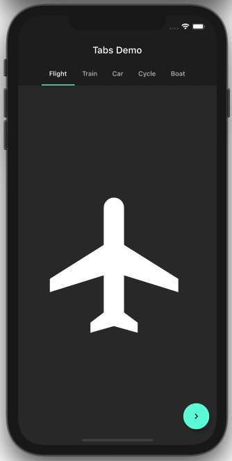
Vertically scrollable tabs with AppBar

Sometimes You should want to Scroll through Tabs Bar Till the End of the Top Screen that hides the AppBar.  the TabBar goes away and hides the AppBar when it’s not needed. by scrolling up,


Hidden Appbar is the Appbar, when we are scrolling the main body of the Application, the Appbar also scrolled and goes to hidden. Here is The Source code to achieve this

DefaultTabController(Sorce 
  length: 5,
  child: Scaffold(
      body: NestedScrollView(
    headerSliverBuilder: (BuildContext context, bool innerBoxIsScrolled) {
      return <Widget>[
        new SliverAppBar(
          title: Text('Tabs Demo'),
          pinned: true,
          floating: true,
          bottom: TabBar(
            isScrollable: true,
            tabs: [
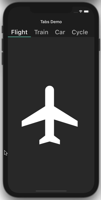
              Tab(child: Text('Flight')),
              Tab(child: Text('Train')),
              Tab(child: Text('Car')),
              Tab(child: Text('Cycle')),
              Tab(child: Text('Boat')),
            ],
          ),
        ),
      ];
    },
    body: TabBarView(
      children: <Widget>[
        Icon(Icons.flight, size: 350),
        Icon(Icons.directions_transit, size: 350),
        Icon(Icons.directions_car, size: 350),
        Icon(Icons.directions_bike, size: 350),
        Icon(Icons.directions_boat, size: 350),
      ],
    ),
  )),
);

Changing tabs programmatically

Most of the time we need more Than Basic TabBars  Sometimes you may need to move to the next tab with the click of a button. Here’s how you do that.
Use the TabController to move to the next page with the click of a button:  assign initial TabController with 0 (zero-index ) and Increment this index when Button Pressed
TabController _controller= initialindex=0;
import 'package:flutter/material.dart';
import 'package:flutter_tutorials/Screens/accountpage.dart';
import 'package:flutter_tutorials/Screens/homepage.dart';
import 'package:flutter_tutorials/Screens/settingpage.dart';

void main() {
  runApp(MaterialApp(
    title: "TabBar page View",
    home: TabBarPage(),
  ));
}

class TabBarPage extends StatefulWidget {
  TabBarPage({Key? key}) : super(key: key);

  @override
  State<TabBarPage> createState() => _TabBarPageState();
}

class _TabBarPageState extends State<TabBarPage> with TickerProviderStateMixin {
  TabController? _controller;
  int initialIndex = 0;
  @override
  void initState() {
    // TODO: implement initState
    super.initState();
    _controller =
        TabController(length: 3, vsync: this, initialIndex: initialIndex);
  }

  @override
  Widget build(BuildContext context) {
    return DefaultTabController(
      length: 3,
      child: Scaffold(
        appBar: AppBar(
          title: Text("TabBar view"),
          // ignore: prefer_const_constructors
          bottom: TabBar(
              controller: _controller,
              indicatorWeight: 10,
              indicatorColor: Colors.amberAccent,
              tabs: const <Widget>[
                Icon(Icons.home),
                Icon(Icons.account_balance),
                Icon(Icons.settings),
              ]),
        ),
        body: TabBarView(controller: _controller, children: [
          Homepage(),
          accountPage(),
          SettingPage(),
        ]),
        floatingActionButton: FloatingActionButton(
          child: Text("Next TAB"),
          onPressed: () {
            setState(() {
              initialIndex = initialIndex + 1;
            });
          },
        ),
      ),
    );
  }
}

 Here is What we Archive Above when Button is Pressed The TabBar moves to The nest TabBars


Listening for tab change event

You may want to perform some operations when a specific tab is open. This callback comes in handy when you want to perform initializing something again when a particular tab is open or destroy something when the tab is not open.
You Can add Listener Method To the TabController  

@override
void initState() {
  // TODO: implement initState
  super.initState();
  _controller = TabController(length: 5, vsync: this);

  _controller.addListener(() {
    setState(() {
      _selectedIndex = _controller.index;
    });
    print("Selected Index: " + _controller.index.toString());
  });
}
As You Can see we Created  _controller.addListener inside initState() 
this method tells us whether the TabBar is opened or not, when the Tababr is Opened this method is called and we got the Current selected Tabbar, and we Can Perform whatever we want to do 


  _controller.addListener(() {
    setState(() {
      _selectedIndex = _controller.index;
    });
    print("Selected Index: " + _controller.index.toString());
  });
Tip: If you implement onTap of TabBar for the tab change event, like this:

bottom: TabBar(onTap: (){

},


No comments

Powered by Blogger.